
PetCo
A conceptual redesign of the PetCo app on a UX team

1. Overview
Background
PetCo is a national pet supply chain store, founded in 1965. Today, they have over 1,500 locations throughout the United States.
"PetCo is a category-defining health and wellness company focused on improving the lives of pets, pet parents and our own PetCo partners."
Role
Interaction Lead on a team of 3 UX Designers
Timeline
2 week design sprint
Type
Mobile App
Tools
Figma, FigJam, GoodNotes, Canva, Google Suite, Zoom
2. Discovery & Research
The Problem
When we got the assignment for PetCo we were presented with this problem:
Due to COVID, PetCo needs help:
Managing the availability of veterinarians by creating various appointment options
Building out the mobile app to help clients
User Interviews
In order to back up PetCo's problem with user data, we created a survey and received over 40 responses from pet owners. View the survey here. We then interviewed 12 of those surveyed. As a team, we completed an affinity map, pictured below, and came away with 4 key takeaways.
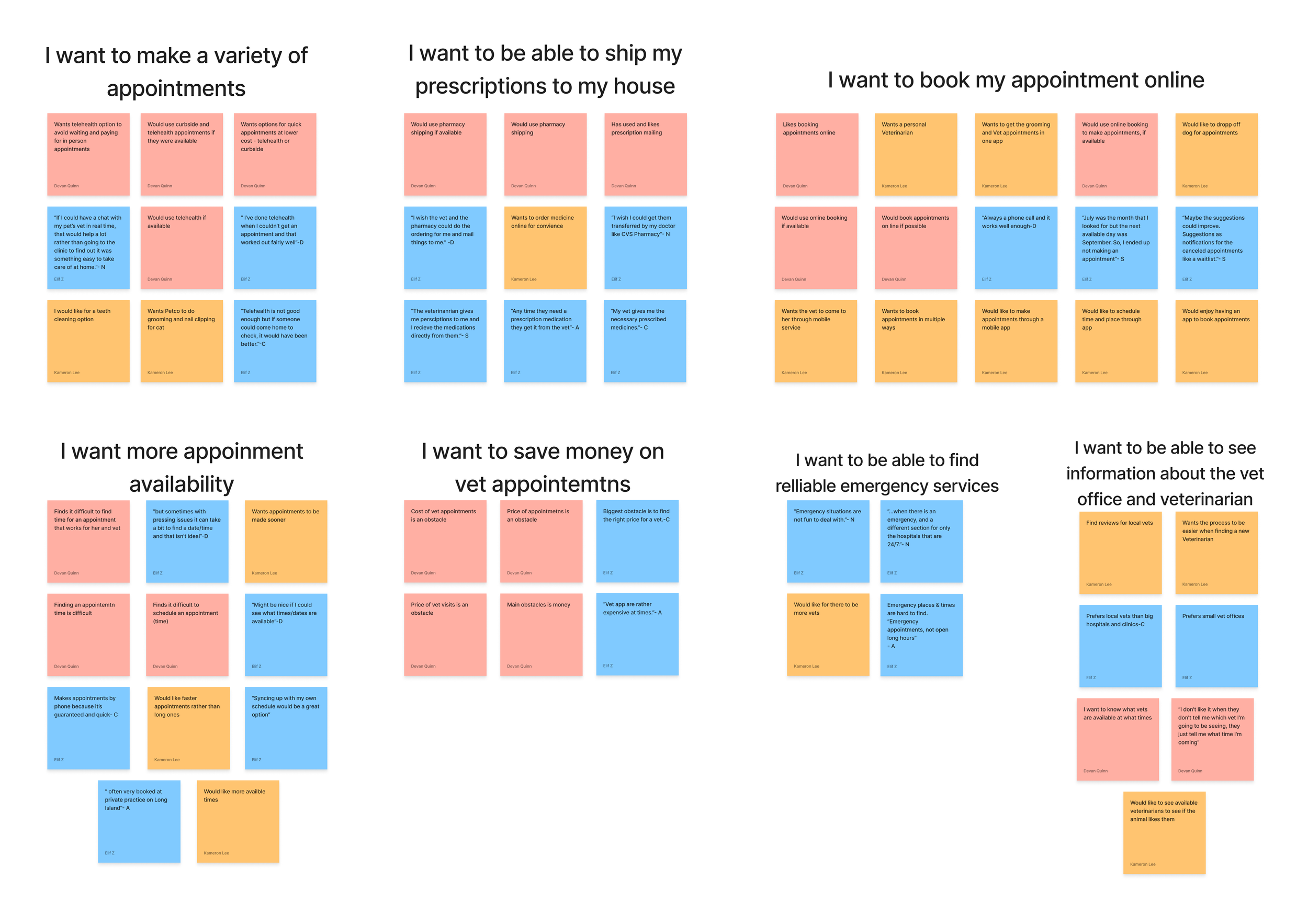
Key Takeaways
9/12 interviewees want a variety of appointment options
6 users want the option for telehealth appointments
6/12 interviewees state that cost was a major obstacle in booking an appointment
The interviews backed up PetCo's initial problem of the need for more appointment options, such as telehealth. It also revealed another problem: the cost of veterinary appointments.
Persona
After gaining a better understanding of both the business goals and user needs, the planning lead created a persona to represent our target users.
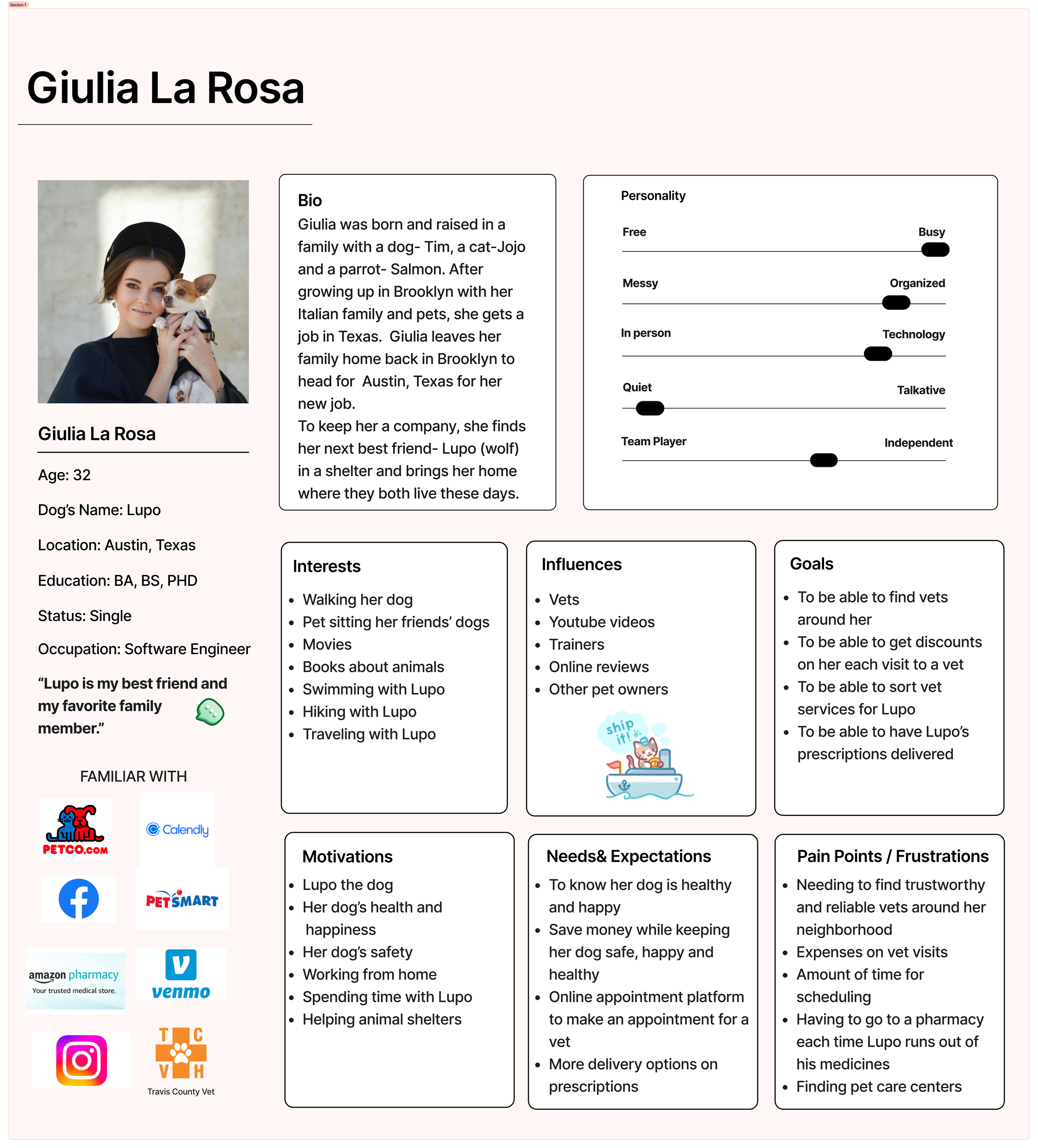
Problem Statement
Giulia needs to book various veterinary appointments online so that she can find a time that works for their schedule and save money by booking less expensive services.
How Might We….
Help pet owners save money
Help users book efficient appointments
Help users book online
Help users choose their vet
Help users choose a date and time that works for them
Help users find the right type of appointment
Help users contact veterinarians for small concerns
Current App
We conducted a heuristic evaluation to evaluate the strengths and opportunities in the app. We found 3 major pain points we decided to address in our redesign. View the entire report here.
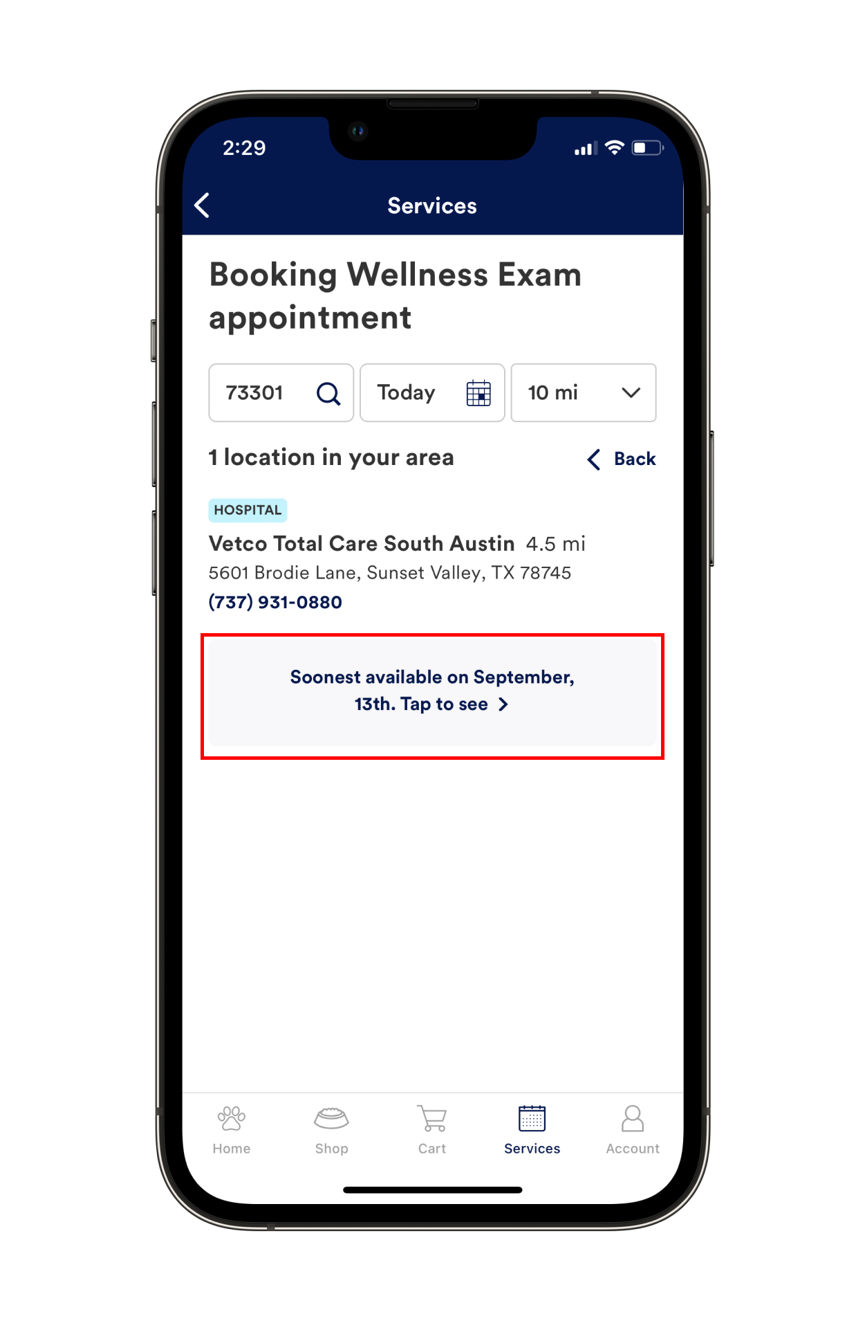
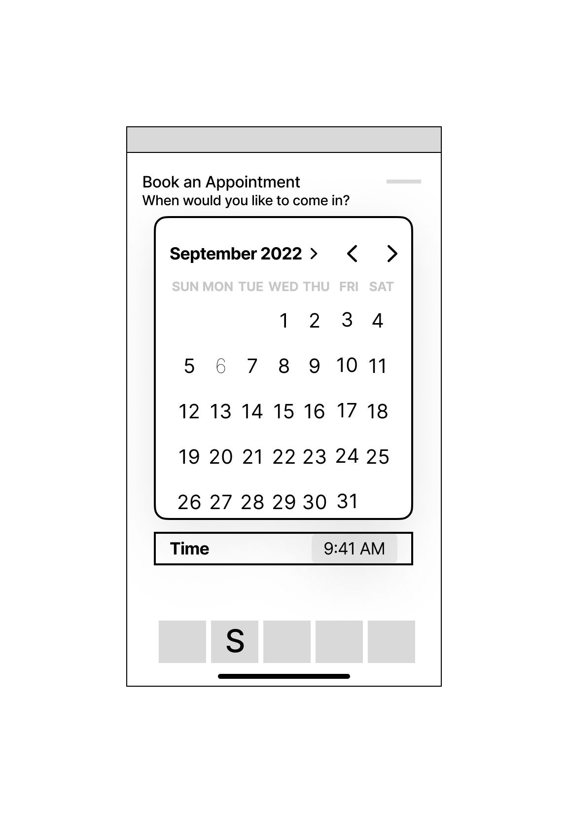
1. Lack of appointment times and types
Many areas we tested had weeks long waits before an appointment was available. Additionally, only in person appointments were available, which doesn't allow for much flexibility in scheduling and requires customers to drive all the way to the PetCo veterinary office, even for quick questions or concerns.
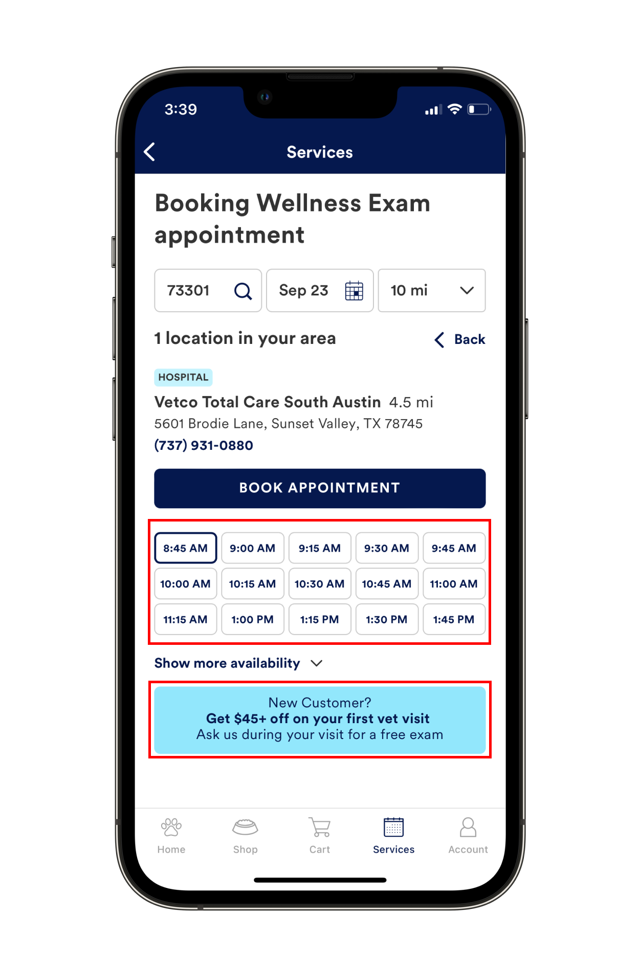
2 & 3. Booking Page - Appointment Information & Money Saving Opportunities
The booking page had two issues. First, users have very limited information when choosing an appointment. They can only view available times, not the veterinarian that they will see that time.
Second, the booking page has a banner advertising a discount for first time customers, which is a good money saving opporutnity. However, users must remember to ask for the discount at their appointment, there is no way for them to apply the discount to their appointment from the app. Additionally, it is a one time discount only, with no other opportunity to save money for return customers.
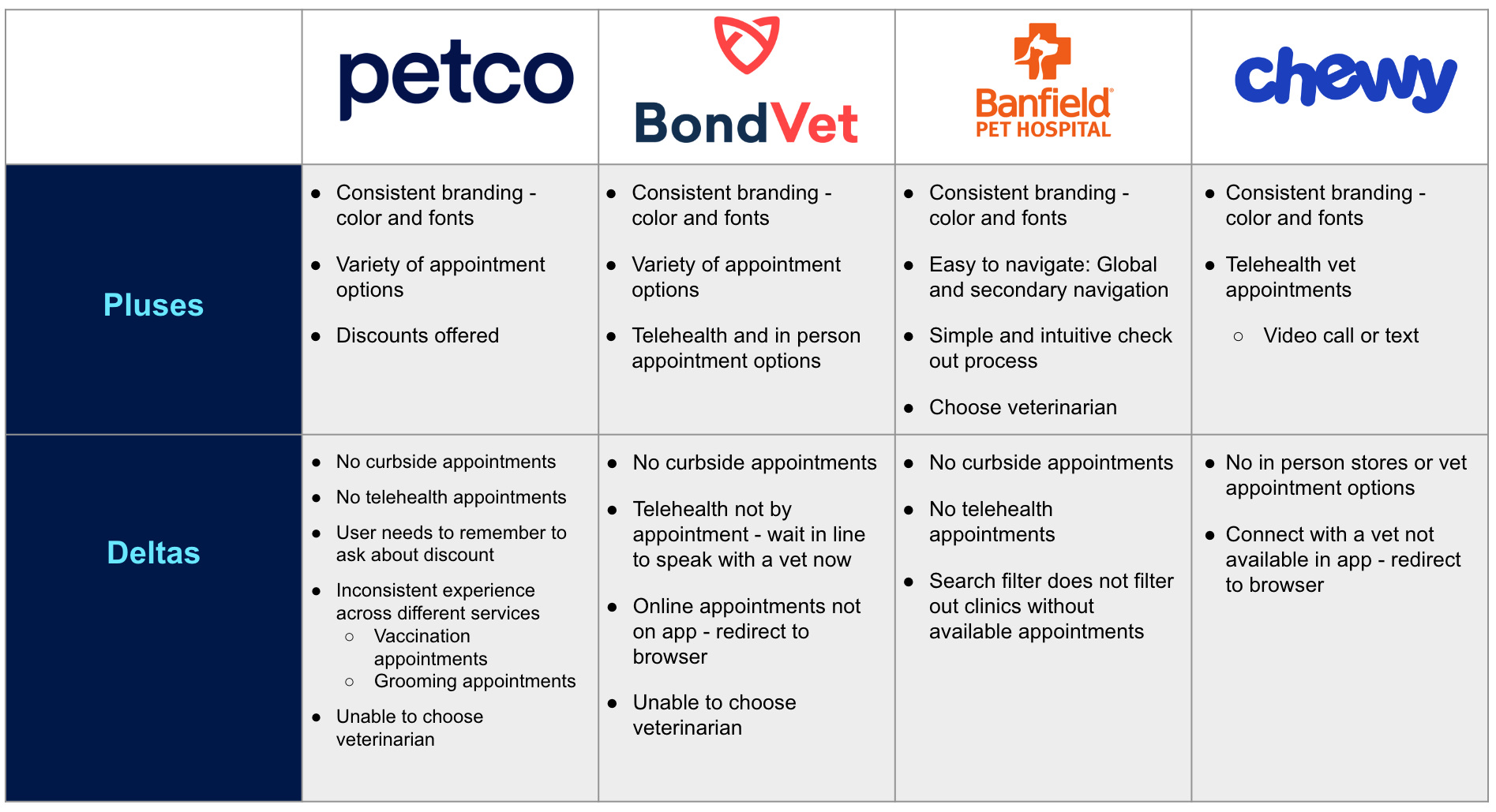
Competitive Analysis
Once we had found the issues with the Petco website, we looked at other veterinary apps to find what they were doing that we could implement to make a better user experience at PetCo. The research lead conducted a feature analysis, available here, the planning lead conducted a task analysis, available here, and I conducted a pluses and deltas, pictured below and available here.
3. Ideation & Sketching
User Flows
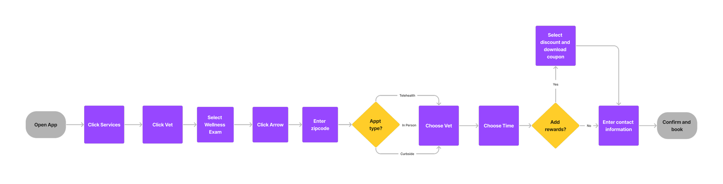
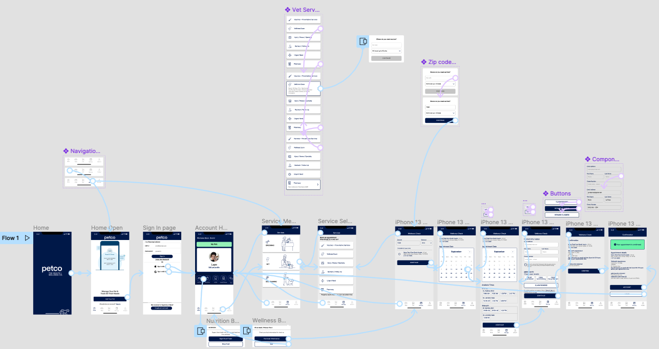
To begin the design stage, I created a user flow as the design lead to help focus the team on the screens we would need to focus on.
Flow - Book a telehealth appointment
In this flow, users will be able to easily find the sweaters category and filter results to narrow their choices. They will then be able to quickly check out with a straight forward check out process.
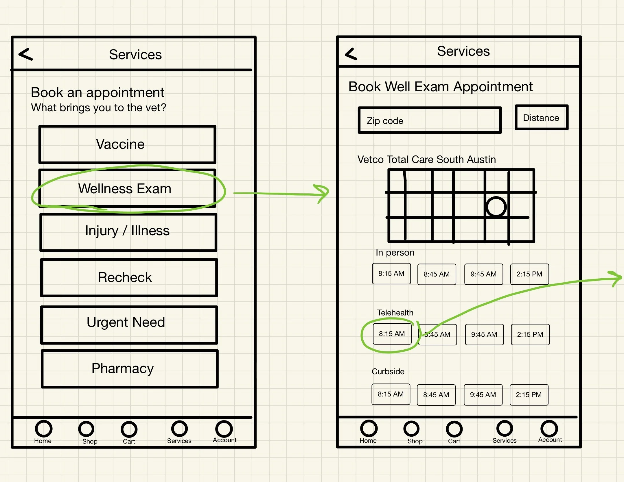
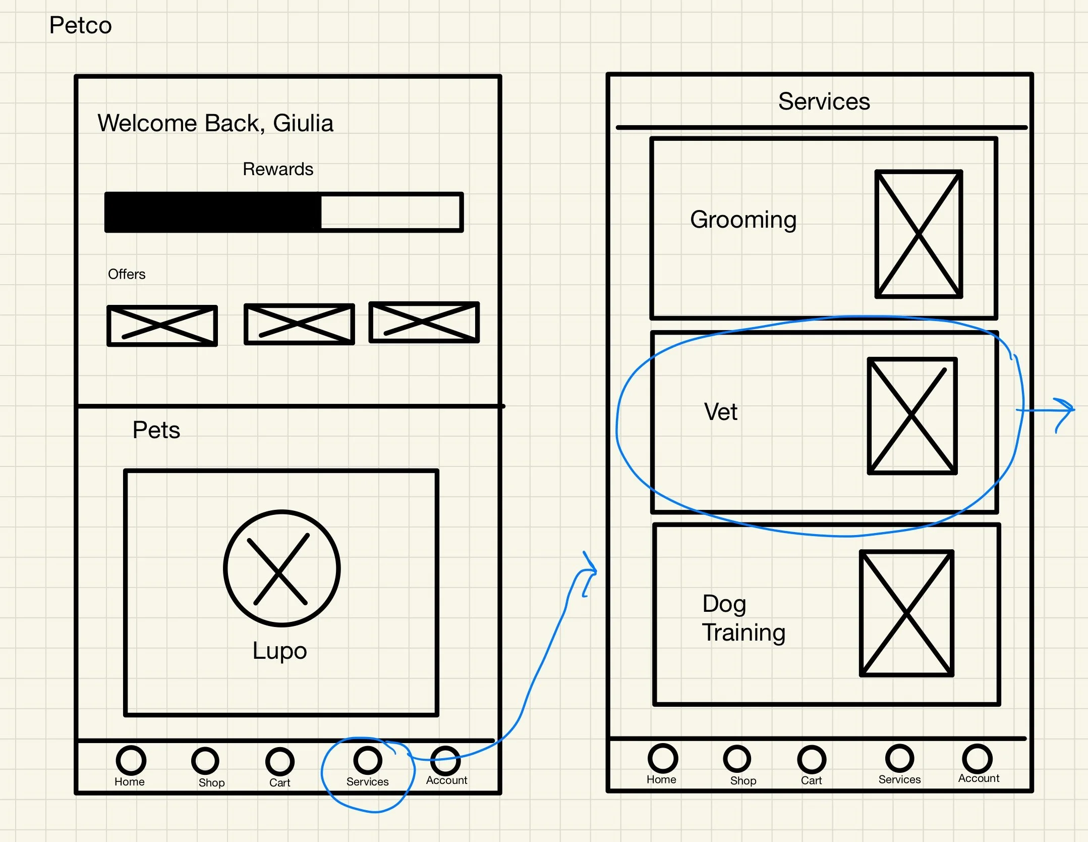
Sketches
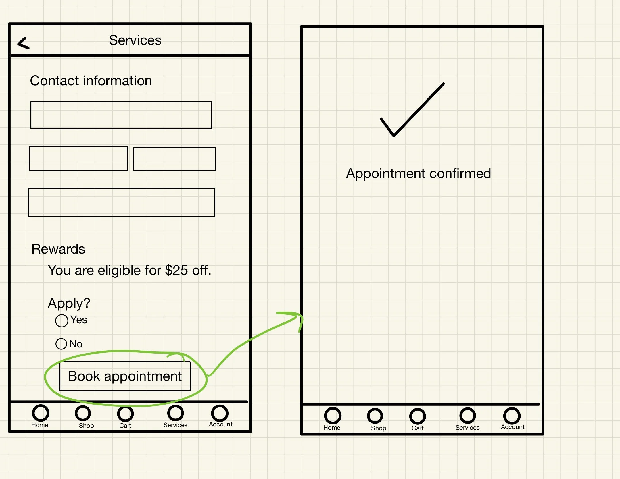
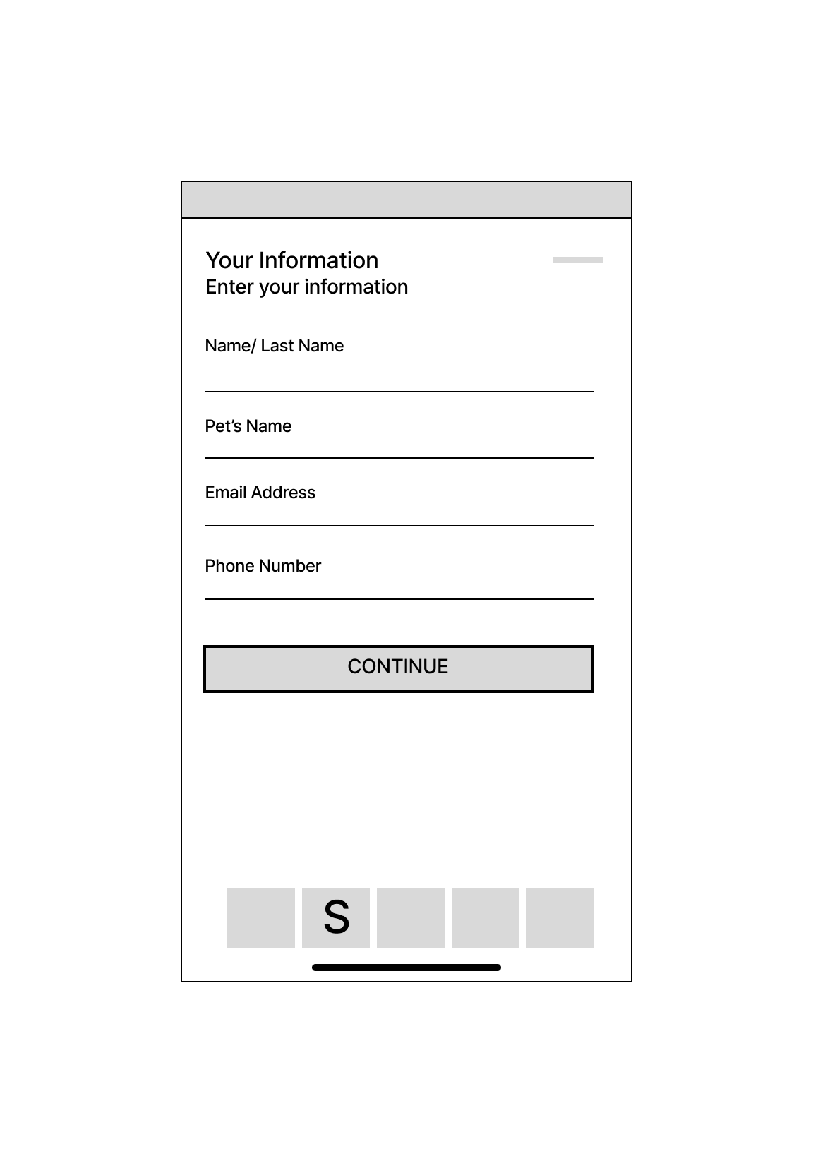
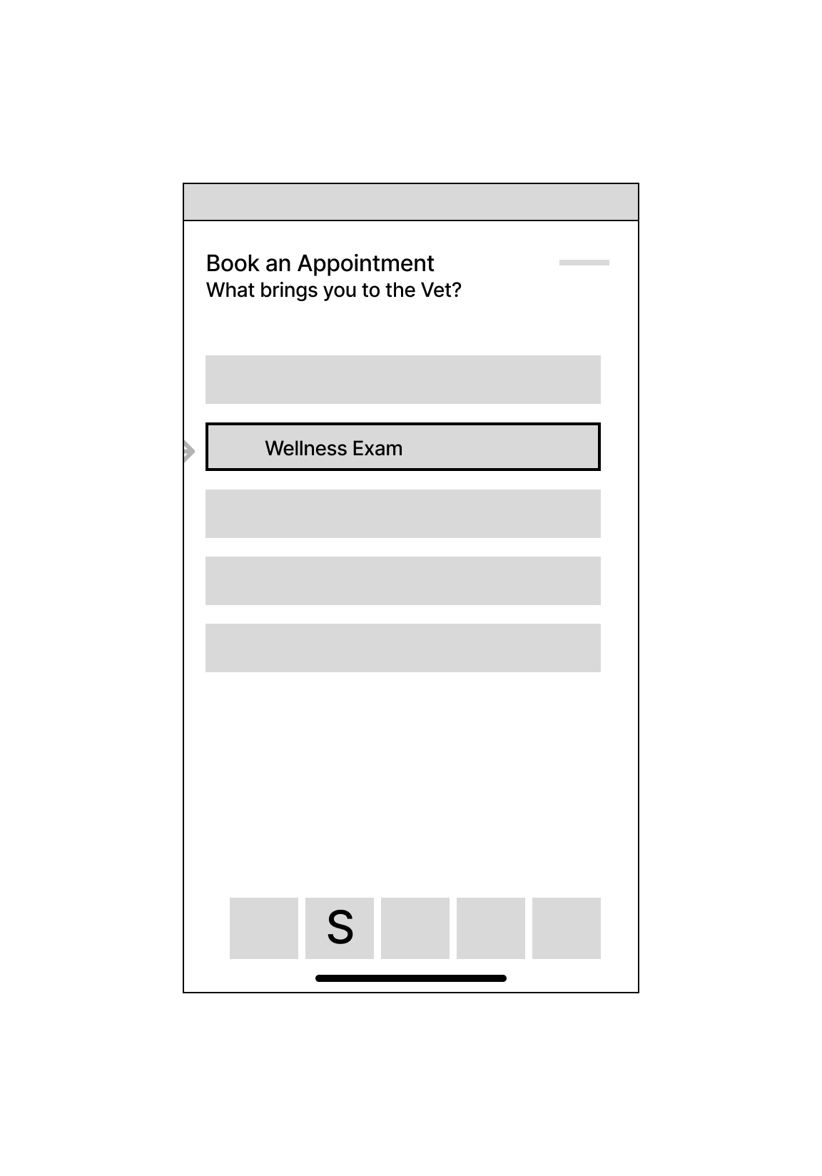
After approval from the team on the user flows, I sketched the main screens on my iPad. We decided to maintain the beginning of the flow as it was on the app, with the home screen, services tab, and the different veterinary services. From there we decided to add the various appointment options and the ability to add rewards for repeat customers to save money.
4. Wireframes & Prototypes
Wireframes
My team gave me feedback on my sketches and the planning lead transferred the sketches to digital wireframes with more detail.
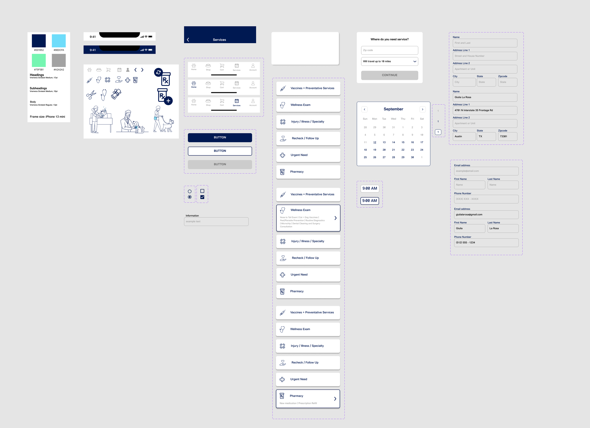
Components
Before we began to move to high-fidelity wireframes, I created a components library. The library included the colors hex codes, the fonts, buttons, navigation bars, and more that we would need to create a cohesive product. View the components library here.
Prototype
Each team member focused on a different set of screens, moving from low fidelity to high fidelity wireframes. We then worked together to give each other feedback, make all screens cohesive, and connect the screens into a prototype.
Once we had the first prototype ready, we conducted 9 usability tests to gather feedback on our design and to find pain points and areas of improvement.
5. Usability Testing
Key Insights
9 / 9 users were able to complete the vet appointment flow
9 / 9 users were able to complete the reorder prescription flow
3 / 9 users wanted to be able to learn about the vet they chose
5 / 9 users had difficulty reading the confirmation page
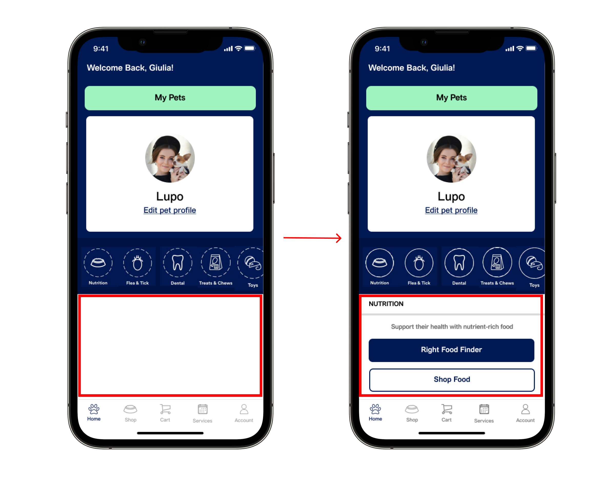
5 / 9 users were confused about the white space on the home page
7 / 9 users noted that the design was intuitive
5/9 users were confused about the white space on the home page. Users had to click on the buttons in the vertical scrolling page to view information there. The research lead changed the design so the first tab was automatically selected to fill the white space, and users can click between buttons to view other screens.
Examples of iterations:
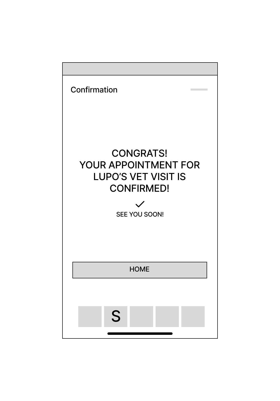
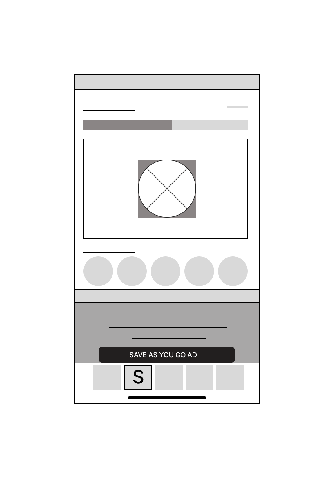
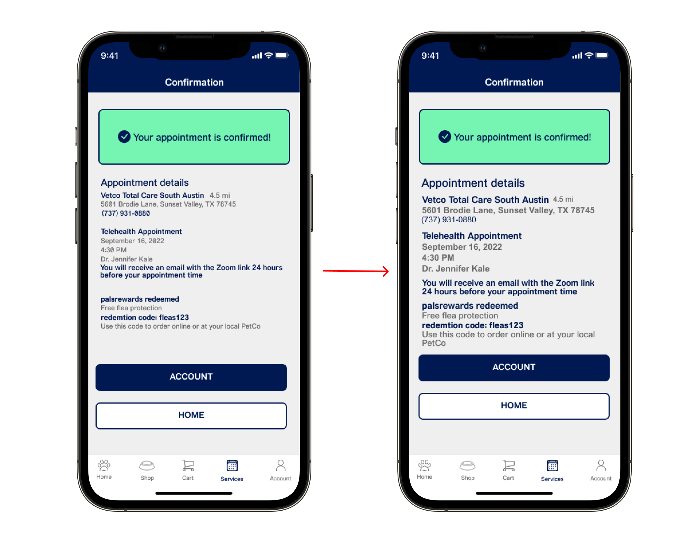
5/9 users had difficult reading the font size on the confirmation page. The planning lead increased the font sizes and spacing on this page for improved visibility and accessibility.
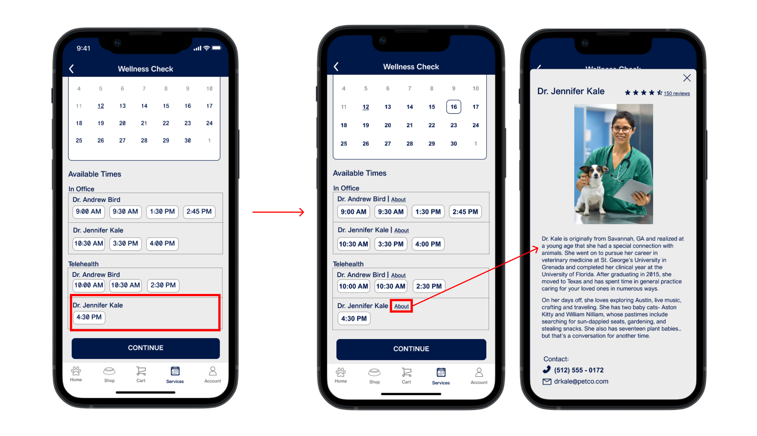
3/9 users wanted to be able to learn about they vet they chose. I added an about button next to the vets names. This button opens an overlay with a short biography and reviews on the selected veterinarian.
After implementing the feedback from our usability tests, we had our final design. View the design on Figma.
6. Final Design
7. Conclusion
Impact
The app solves both business and user problems. It addresses PetCo's original problem by adding telehealth appointments to help free up more time in veterinarians days to quickly move through patients. It also adds convenience for customers looking to address quick questions or concerns without having to commute to the store. It also offers customers incentives to return to PetCo for veterinary services by implementing palrewards, offering customers discounts on services and products.
One quote from user feedback:
"The app is much better after this redesign. It feels like a major upgrade."
Next Steps
Conduct a card sorting
4 / 9 users in the usability test were new PetCo users and did not immediately know to click on services to find vet services so Petco should consider doing a card sorting to reorganize the apps structure
Build out a screen for the rewards program so users can more easily track and use palsrewards.
Conduct more user research to determine any new areas of need.