
VASI Boutique
A conceptual redesign of a local boutique's website
1. Overview
Background
VASI is a boutique in upstate New York, open since 2018. All of the products are hand picked by the owner, Effie, targeting young women and girls who are fashion-forward.
“At VASI's the atmosphere is welcoming and friendly, shopping should be fun and that is our top priority”
Role
Solo UX Designer
Timeline
2 week design sprint
Type
Desktop Website
Tools
Figma, Canva, Optimal Workshop, Google Suite
2. Discovery & Research
Evaluating the current site
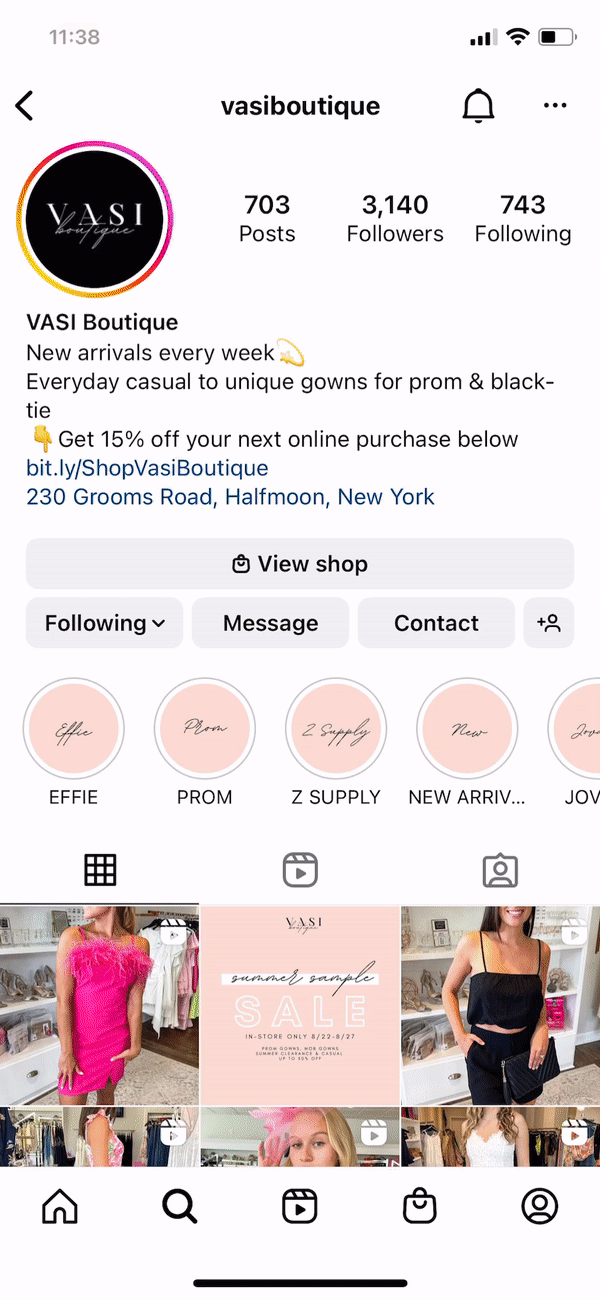
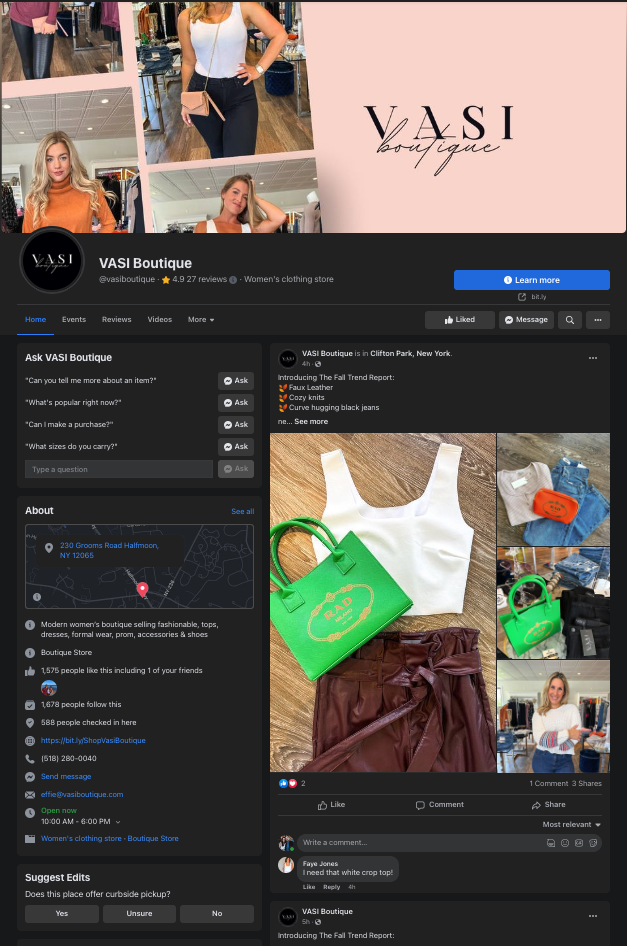
I began this project by looking at VASI's current online presence - both their website and social media pages.
Their social media pages were quite strong - displaying consistent branding and engaging pictures of the owner and employees in new products.
However, the website did not offer the same seamless experience. I conducted a heuristics evaluation to assess the usability of the site and find the pain points. I backed up these findings with contextual inquiries. You can find all of my findings here.
There were 4 key takeaways:
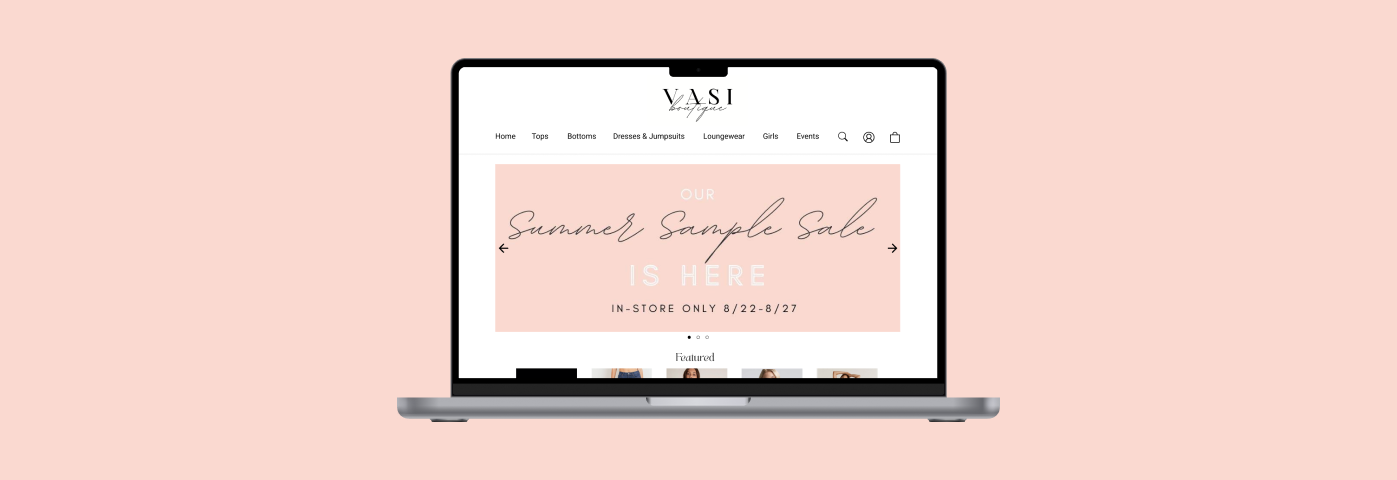
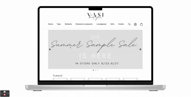
1. Landing Page
The navigation is too complicated with a full screen image that is not clickable and features products that are not available for purchase. Additionally, there are 3 separate buttons to lead to the store, which can also be accessed by scrolling down from the banner.
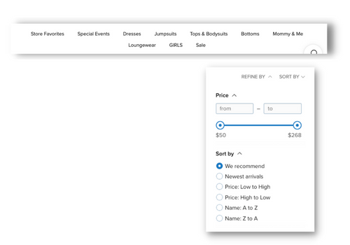
2. Navigation & Filters
There are too many categories with overlapping descriptions, causing an overwhelming two line appearance.
The filtering options are limited, only allowing users to sort by price range or alphabetical order.
3. Products Page
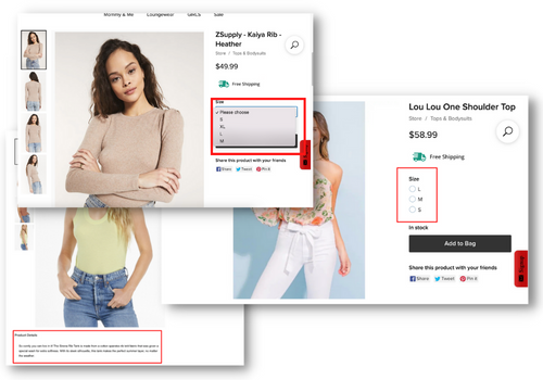
The sizing options were presented in different formats: radio buttons and drop menus. They were also not always presented in the traditional sizing of smallest to largest.
The product description is hidden beneath the product images, making it easy to miss
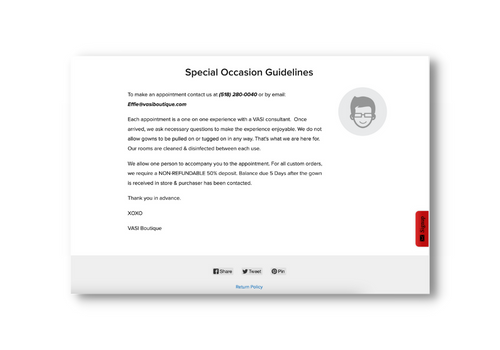
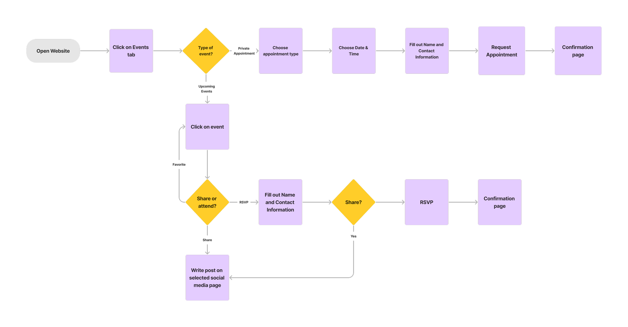
4. Special Occassion Appointments
The option to have a private appointment to select or make a custom gown for a special occasion had a vague description, making it unclear to users what the service is offering. It is also hidden at the bottom of the page, where many users will never find it.
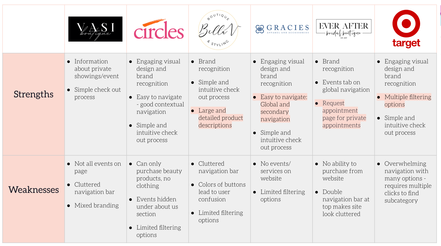
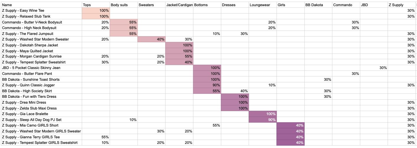
Competitive Analysis
Once I had found the issues with VASI's website, I looked at other e-commerce websites, both local boutiques and national chains, to find what they were doing that I could implement to make a better user experience at VASI. I conducted a feature analysis, available here, a task analysis, available here, and pluses and deltas, pictured below and available here.
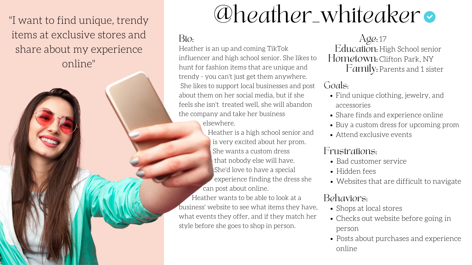
Persona
After discovering the pain points and ares of improvement on VASI's website, I created a persona to keep in mind while I designed the website keeping the target users of young fashion-forward women in mind. I also explored how might we questions and refined the problem statements down to two major flows to focus on while designing.
Problem Statements
Heather needs to find unique and trendy clothing, jewelry, and accessories so that she can share her purchases and shopping experience online.
Heather needs to book a private appointment so that she can get a custom prom dress and share about her experience online.
How Might We….
Make the categories easy to navigate?
Make events easy to find on the website?
Make private appointments more clear?
Make private appointments available to book online?
Make the search/filter feature easy to find?
Make sales items discount stay in the cart?
Make buttons on sizing uniform for every item?
Make the forward/backward progression in the shopping cart easy to navigate?
3. Ideation & Sketching
Information Architecture
To begin site mapping, I conducted a card sorting using Optimal Workshop to get user input into the organization of products on the site. You can find my full report on the results here.
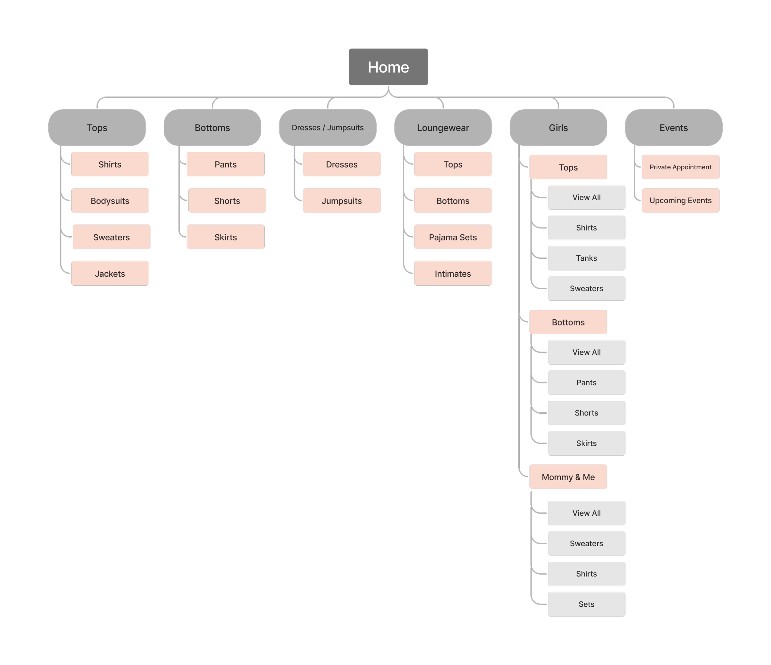
Using this data, I created. a site map to organize the website in a more user-friendly and easy to navigate manner.
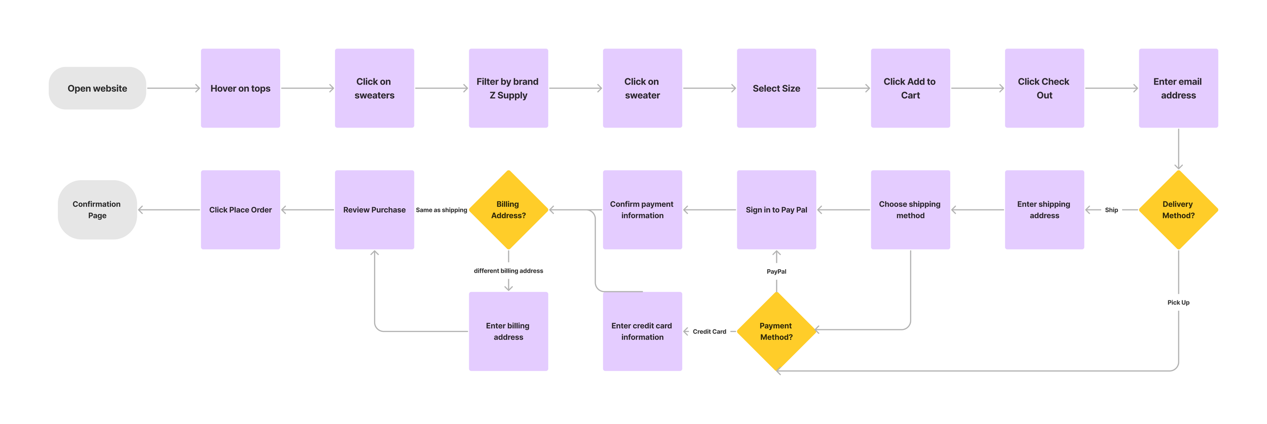
User Flows
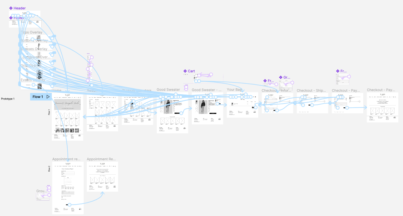
I then focused on creating the user flows for the two problem statements I focused on.
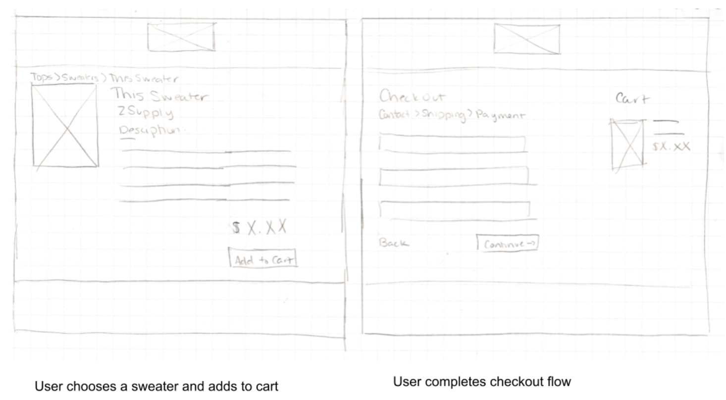
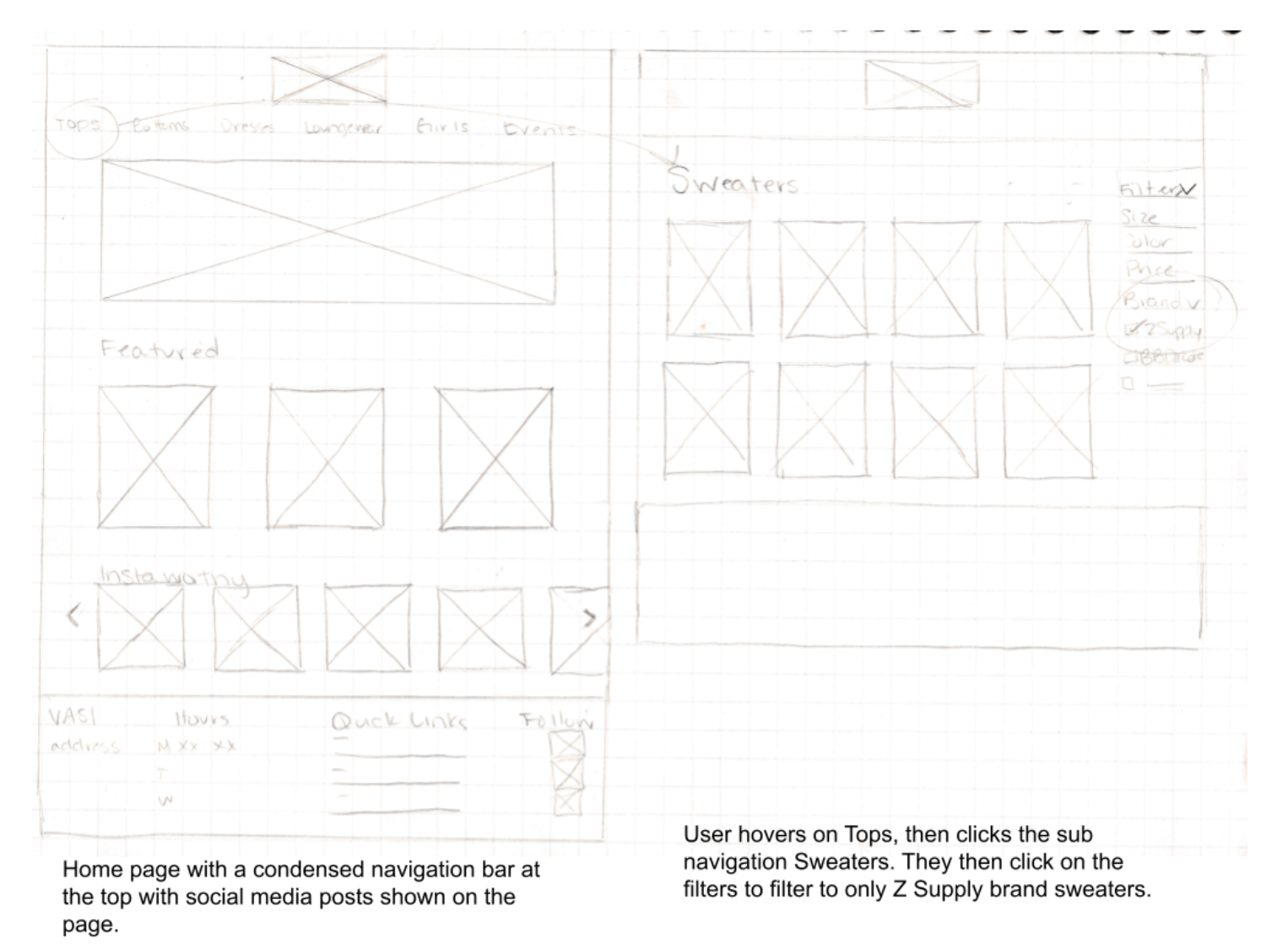
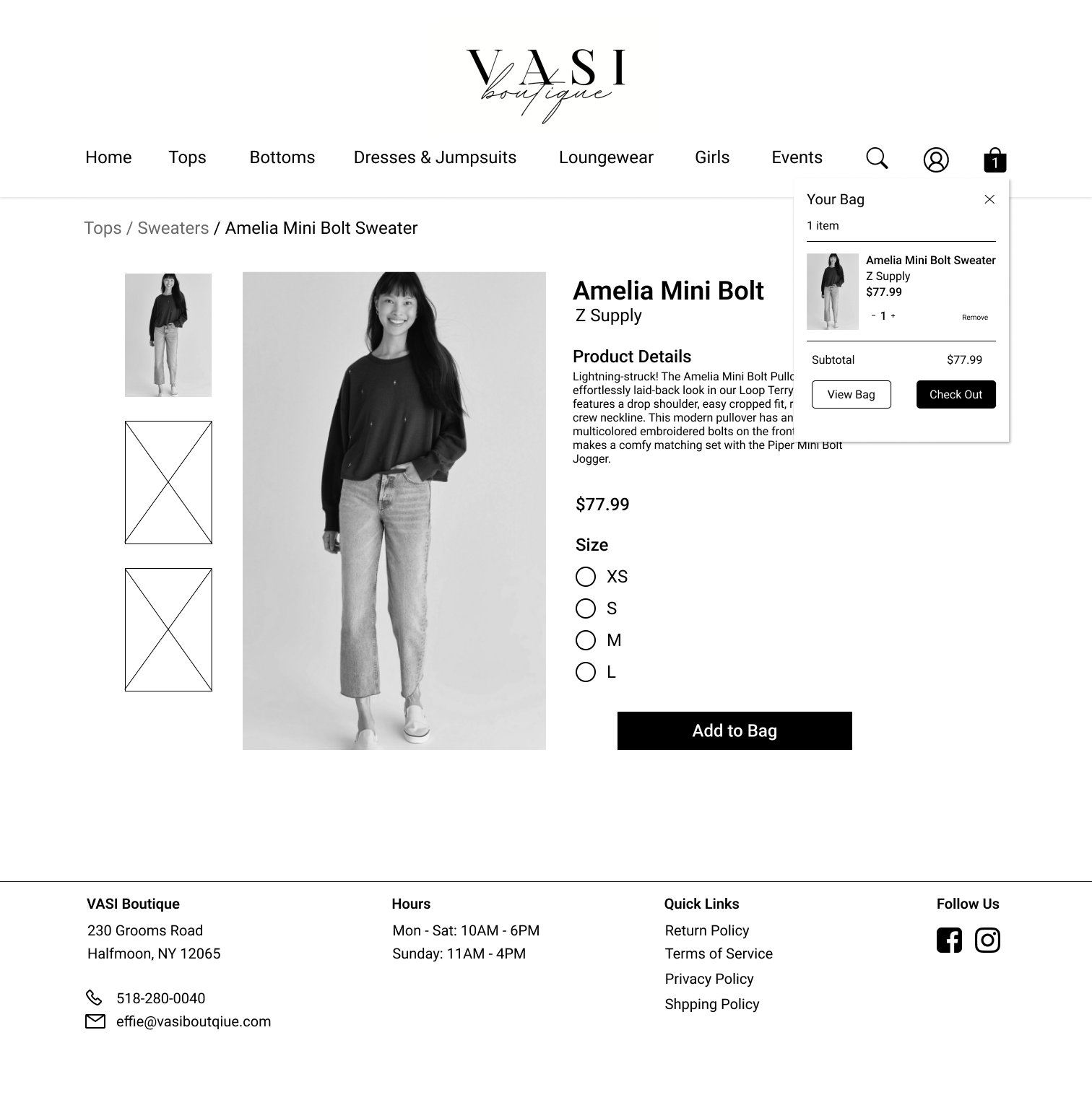
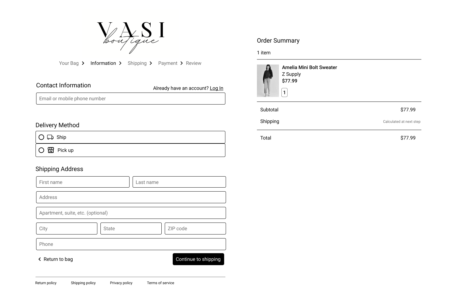
Flow 1 - Find and buy a sweater
In this flow, users will be able to easily find the sweaters category and filter results to narrow their choices. They will then be able to quickly check out with a straight forward check out process.
Flow 2 - Book a private appointment
In this flow users will be able to quickly and easily book a private appointment online without having to call the shop.
Sketches
Finally, I sketched on paper what each screen may look like. I focused on the purchasing user flow, sketching out the most important screens with the new features I was introducing to the website - a clean home page, filtering options, an easy to use products page, and a simple checkout flow.
4. Wireframes & Prototypes
Wireframes
After sketching out ideas and narrowing down design options, I moved to mid-fidelity digital wireframes.

Prototype
I then connected the screens and made my first mid-fidelity prototype. View the prototype here.
Once I had my first prototype ready, I conducted 5 usability tests to gather feedback on my design and to find pain points and areas of improvement.
5. Usability Testing
Key Insights
5 / 5 users were able to complete the checkout flow
5 / 5 users were able to complete the private appointment flow
3 / 5 users praised the user interface
5 / 5 users could not immediately find private appointment form
5 / 5 users had trouble seeing the contrast of the breadcrumbs on the checkout pages to see what step they were on
2 / 5 users wanted social media sharing buttons on the product page
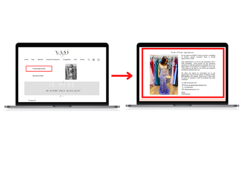
5/5 users did not immediately find the private appointment button under the Events tab in the top navigation bar. To make the service more easily found and advertised, I built out a section on the home page describing the service and a link directly to the appointment request form.
Examples of iterations:
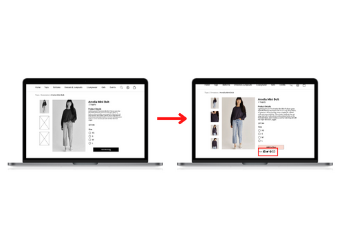
2/5 users wanted to be able to share the items they were about to purchase on social media so, I added social media sharing buttons on the product page.
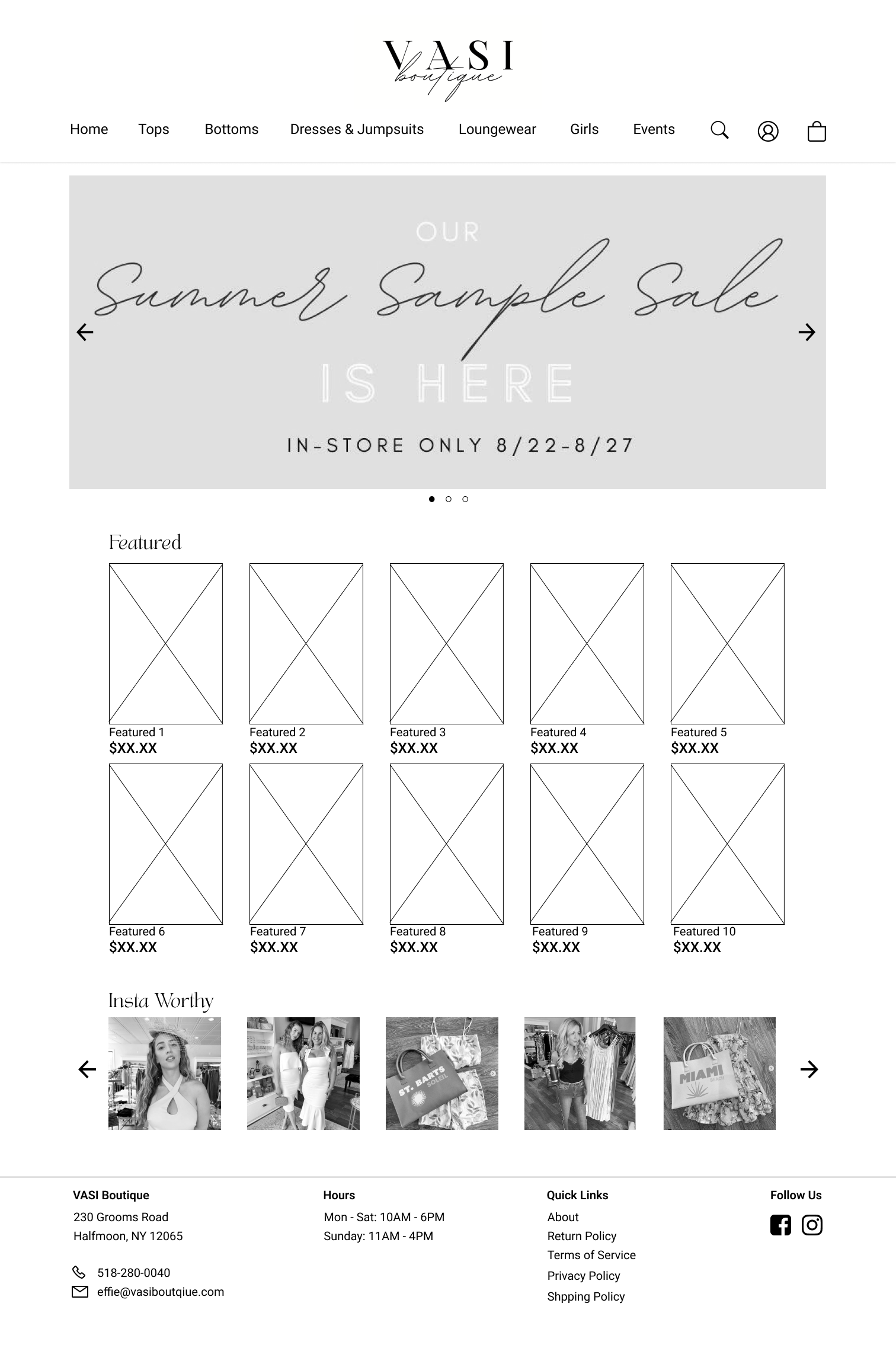
After implementing the feedback from my usability tests, I moved from mid-fidelity to high-fidelity and had my final design. View the design on Figma.
6. Final Design
7. Conclusion
Impact
The website makes it easy for users to find and purchase products on the VASI website. It also advertises and explains the private appointment service the store provides. These improvements benefit both users, who can more easily navigate the site, and the business, which will have more sales and book more private appointments.
One quote from user feedback:
"The website looks so sleek and it's very easy to navigate. You can easily find any products you're looking for"
Next Steps
Build out the accounts page so that users can track purchases, current orders, and manage appointments.
Conduct another round of usability studies to validate whether the pain points users experienced have been effectively addressed.
Conduct more user research to determine any new areas of need.